Visual identity
Barcelona 2023
Haus
Visual identity and custom-made typography for Haus, a team of event organizers, DJ’s and party equipment rental in Barcelona.
Haus has a young, playful spirit, closely linked to music. Our proposal comes from the circular forms of vinyls and DJ tables. We use movement as another communication resource of the brand, and a color palette inspired by the night and by the yellow lights that we find in it.
Visual identity for @hausgigs


Visual identity
Sao Paulo 2021
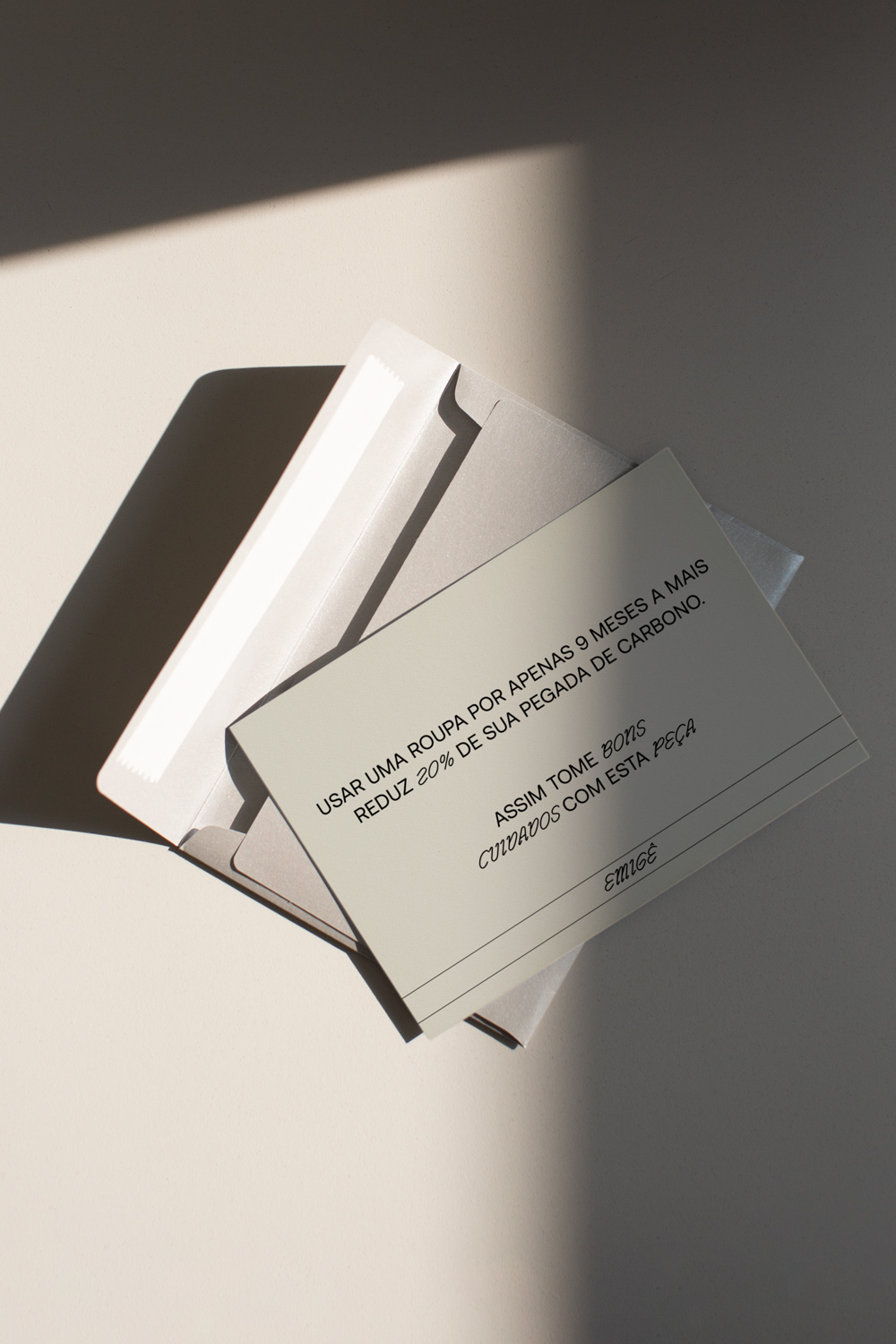
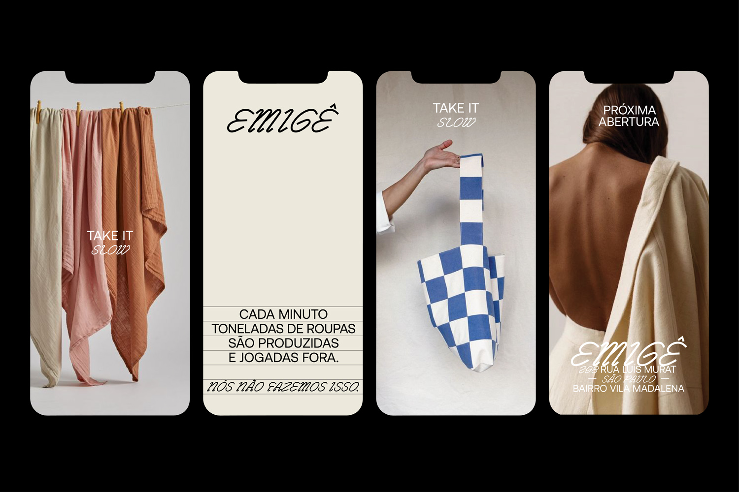
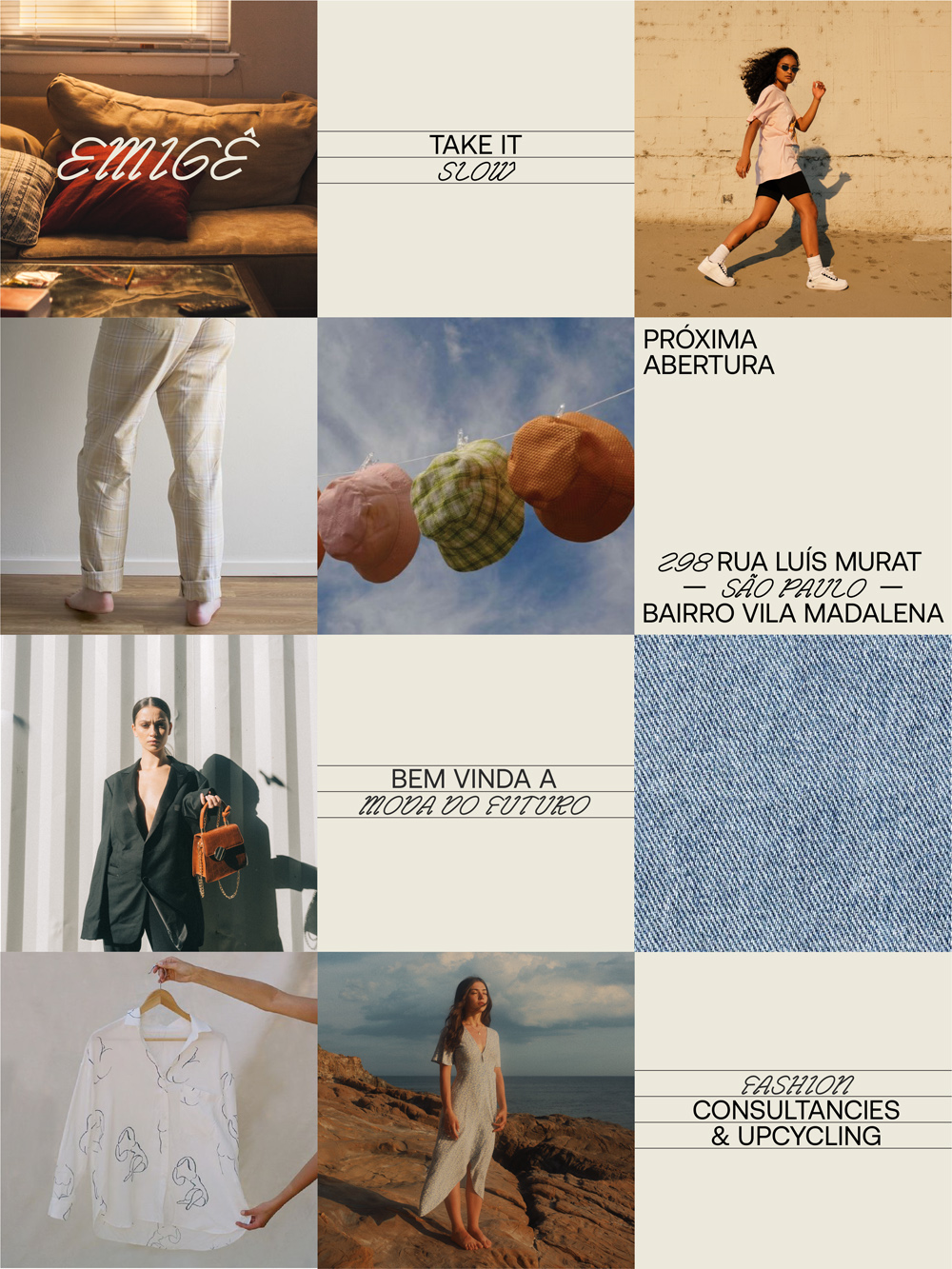
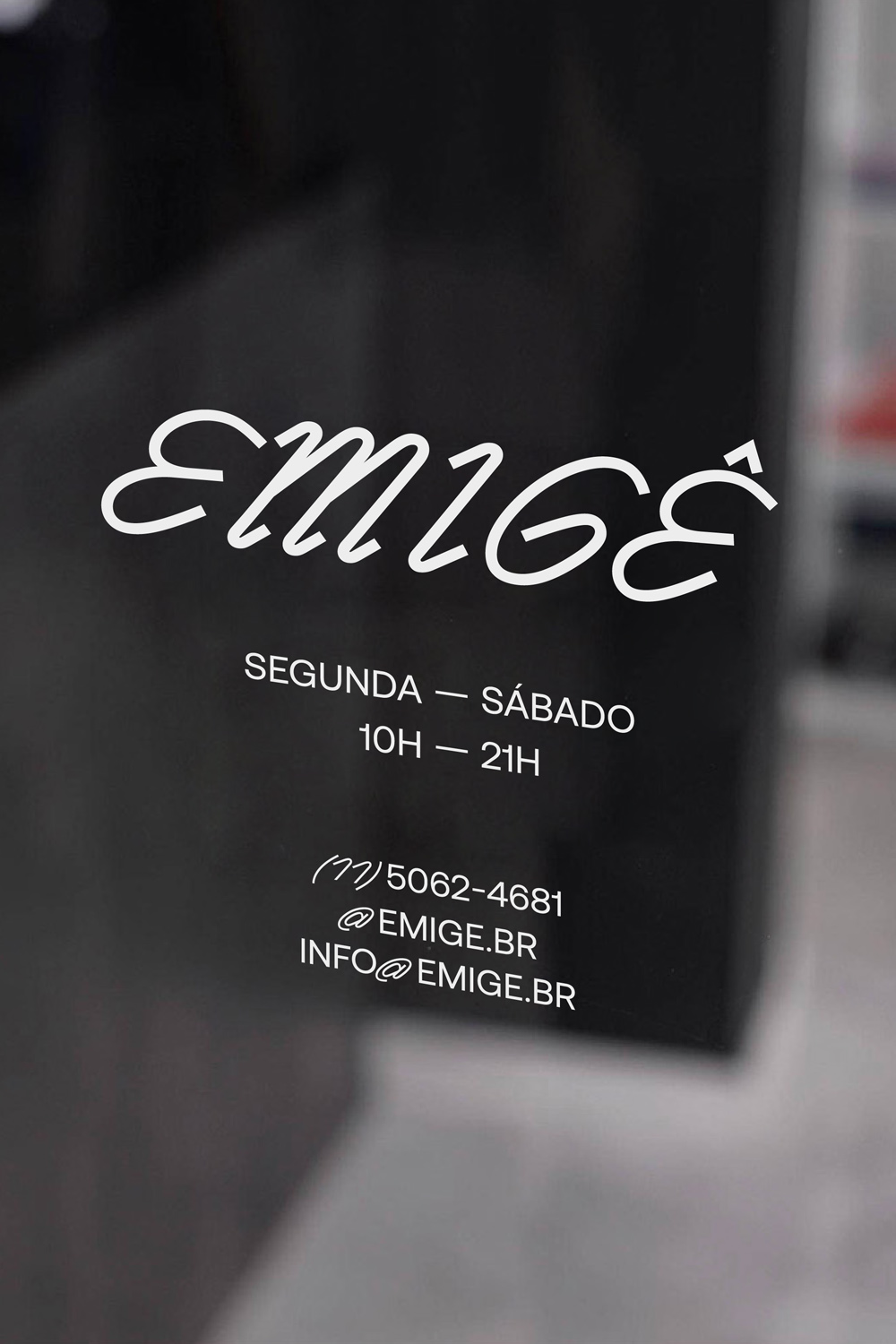
Emigê
Emigê is a Sao Paulo-based circular fashion brand that offers gently used and specially selected clothing pieces. Established in 2020, Emigê was born out of the idea that fashion should be both sustainable and accessible.
The visual identity is based on the pre-loved, pre-worn concept, on the innocent action that we have all done, especially when we were children, of writing our name on the label of a piece of clothing.
This action is summarised using a typographic combination of a script and a sans serif typeface, to represent both the names we wrote and the support we used, the label.


Mixed Works or “Poti-Poti”
Poti-poti n. m.. colloq. In catalan a collection of things mixed up and completely disordered.
Poti-poti showcases a selection of past projects or drafts, ranging from those that have been published to those that have yet to see the light of day.


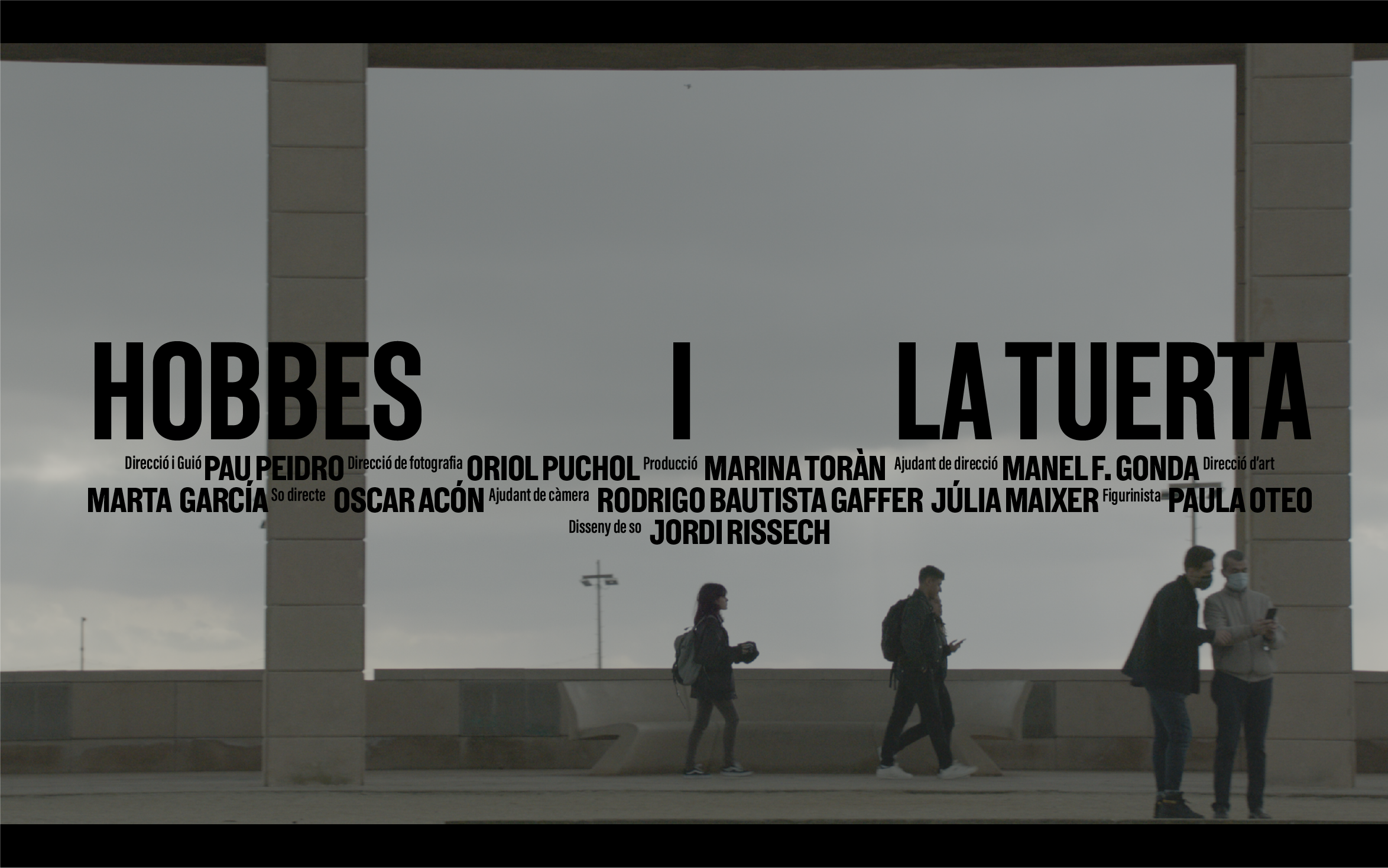


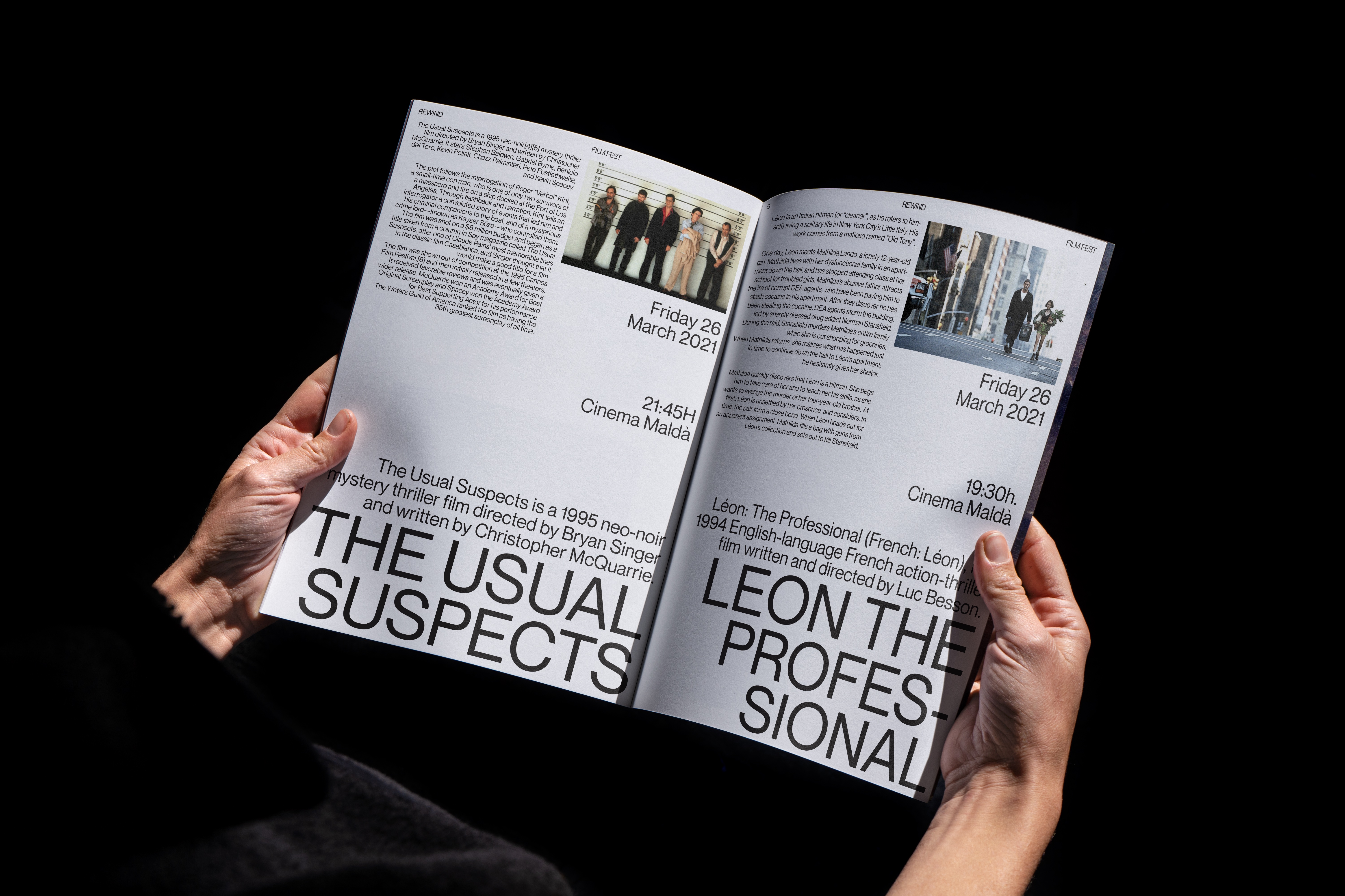
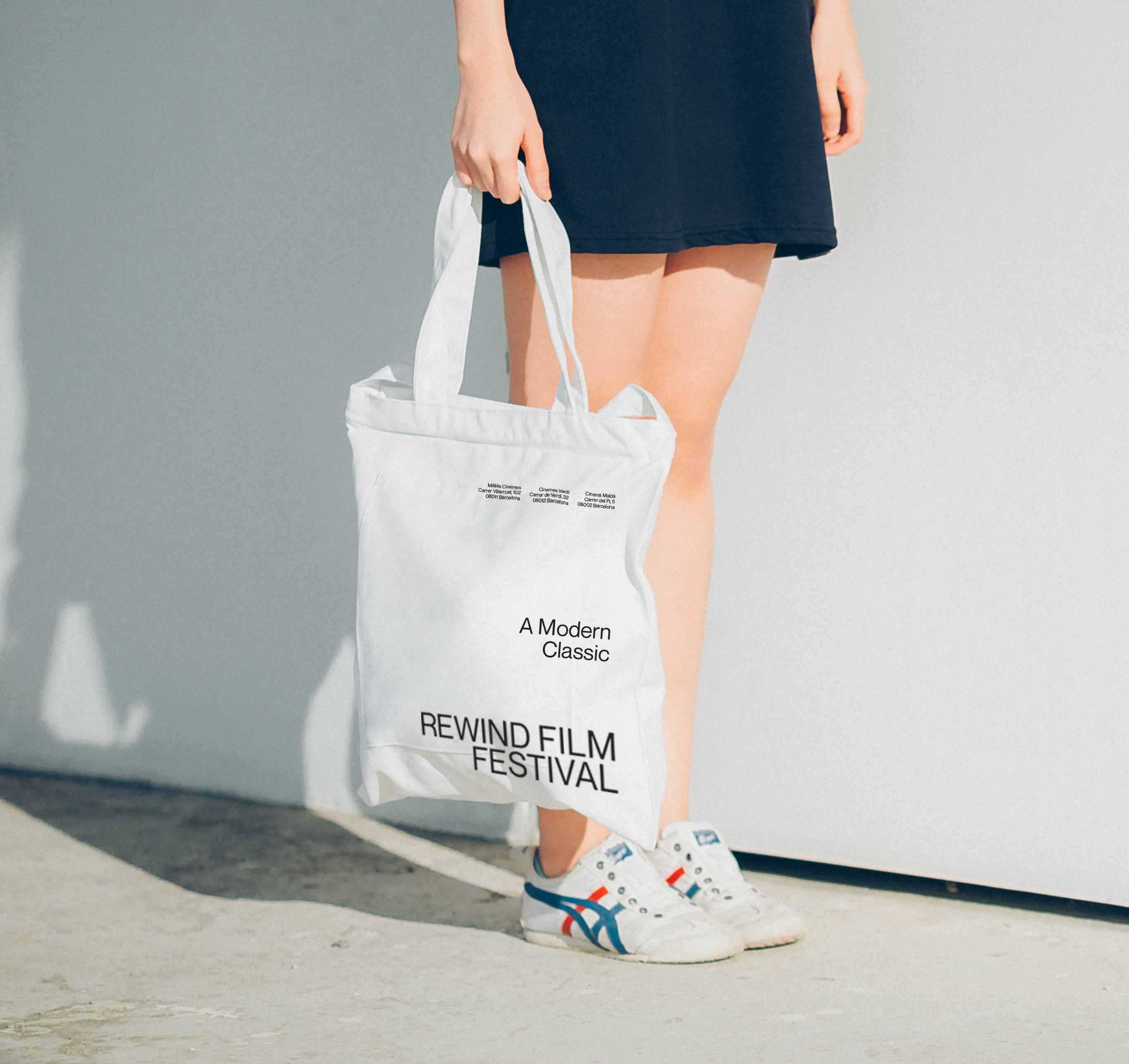
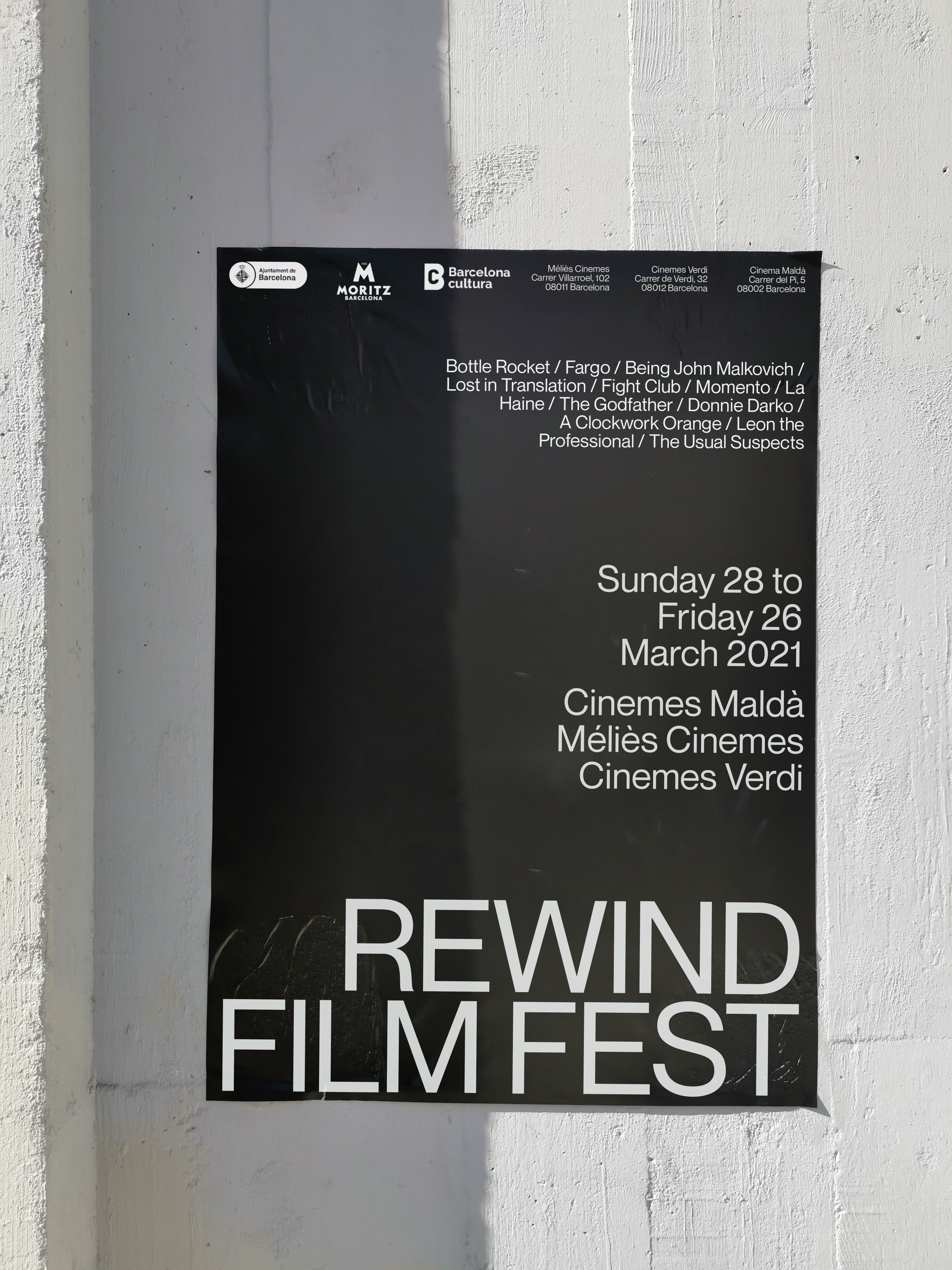
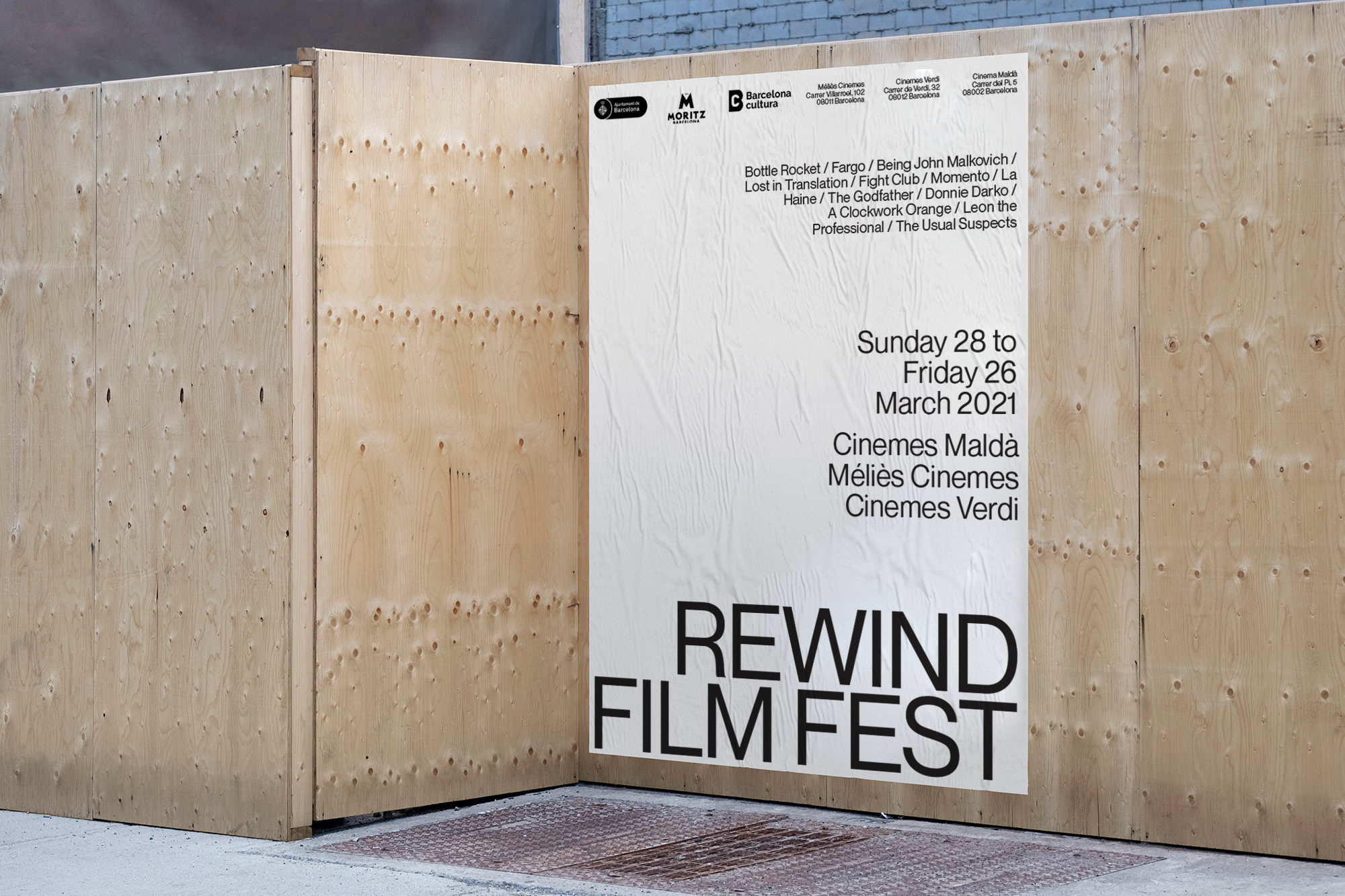
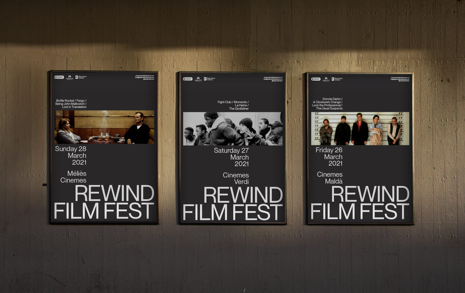
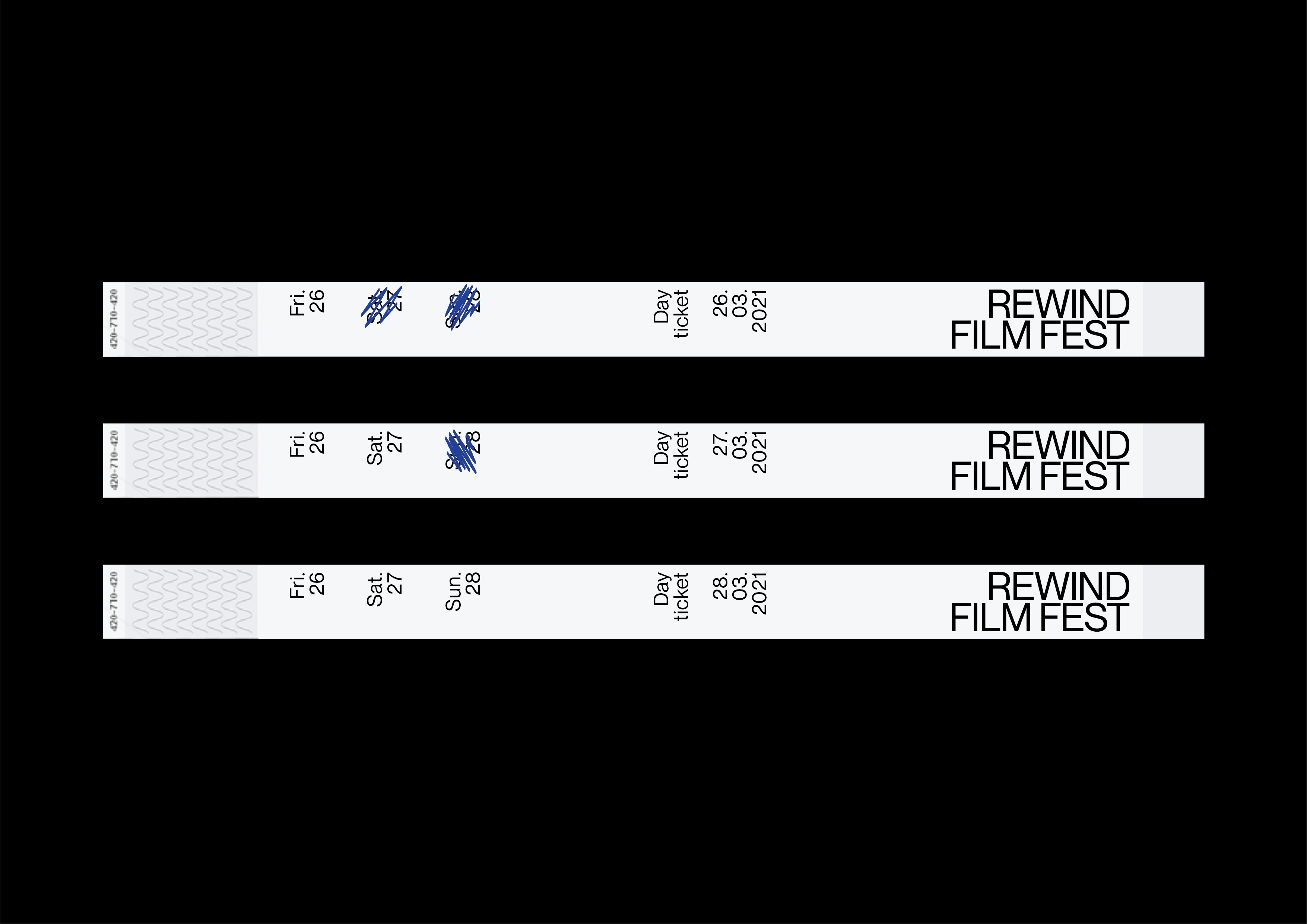
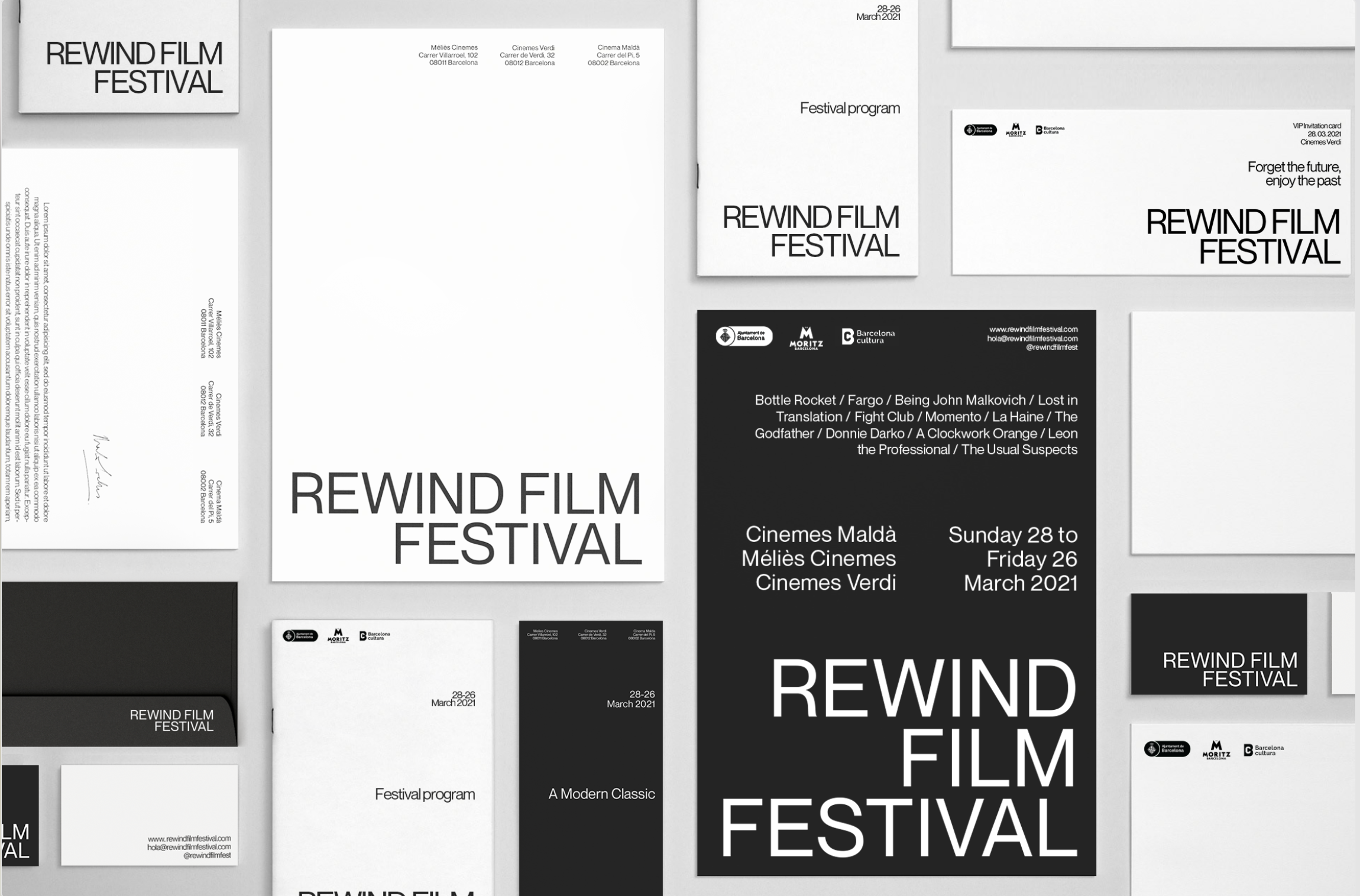
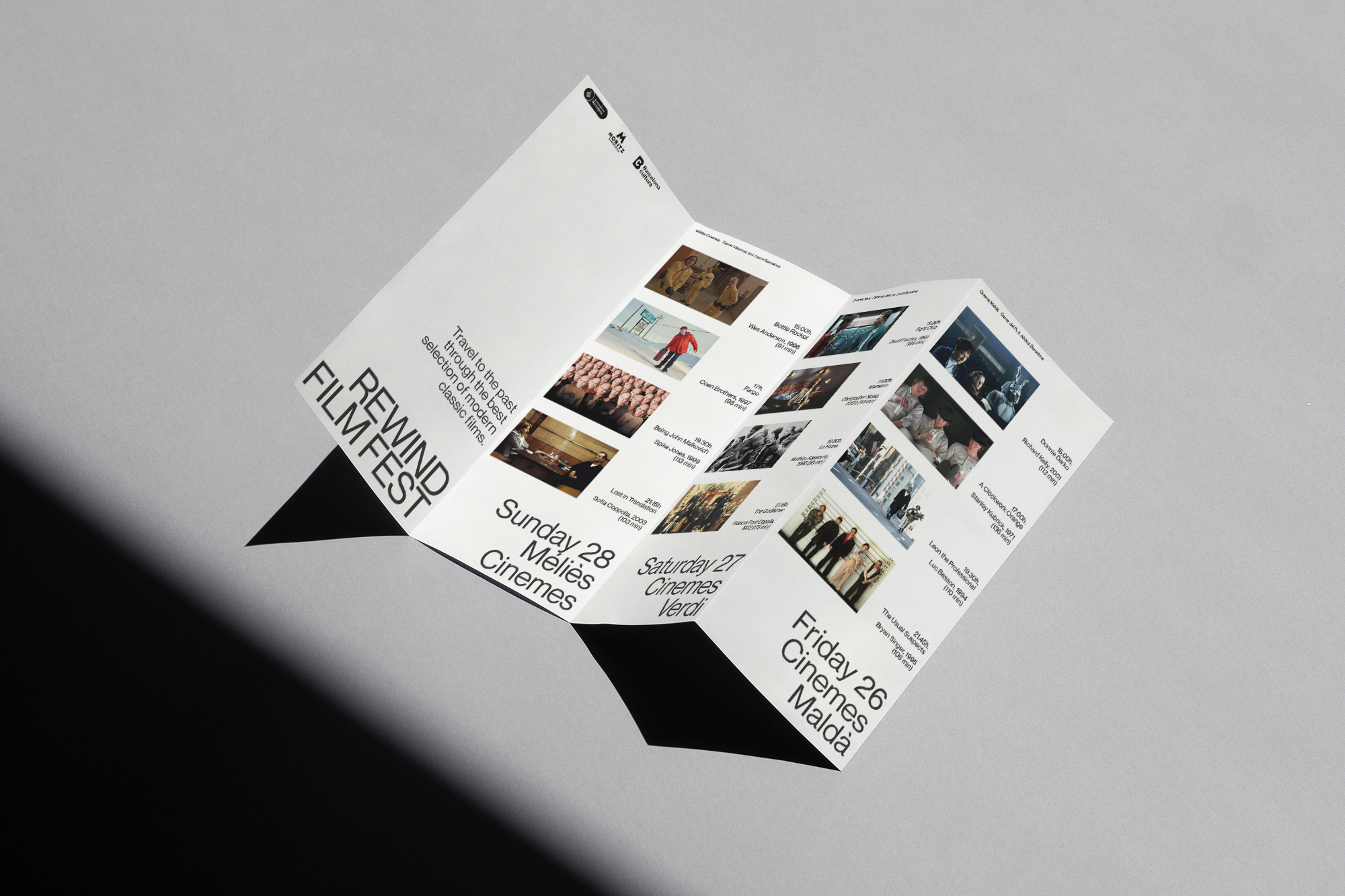
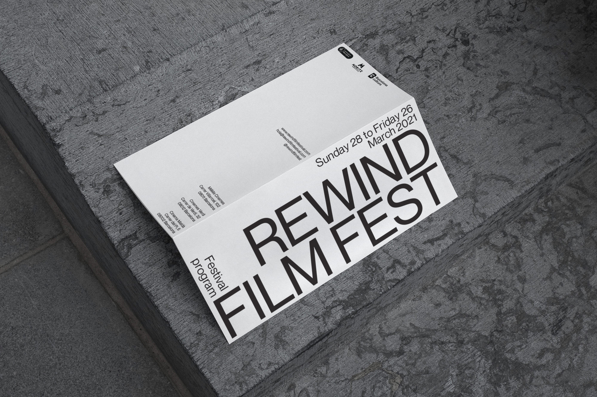
Rewind Film Festival.
Rewind Film Festival is a three day film festival taking place in three independent cinemas in Barcelona. The festival wants you to travel to the past through a selection of modern classic films.
The concept of inverting the course of time was the starting point for the graphic proposal, generating a conceptual system using the inversion of the “normative” hierarchy to represent the concept of going back, going from the end to the begining.
A collab done with Cóilín Phelan @zissou.xyz
Featured in The Best Fine Art Print & Poster Designs by DesignRush


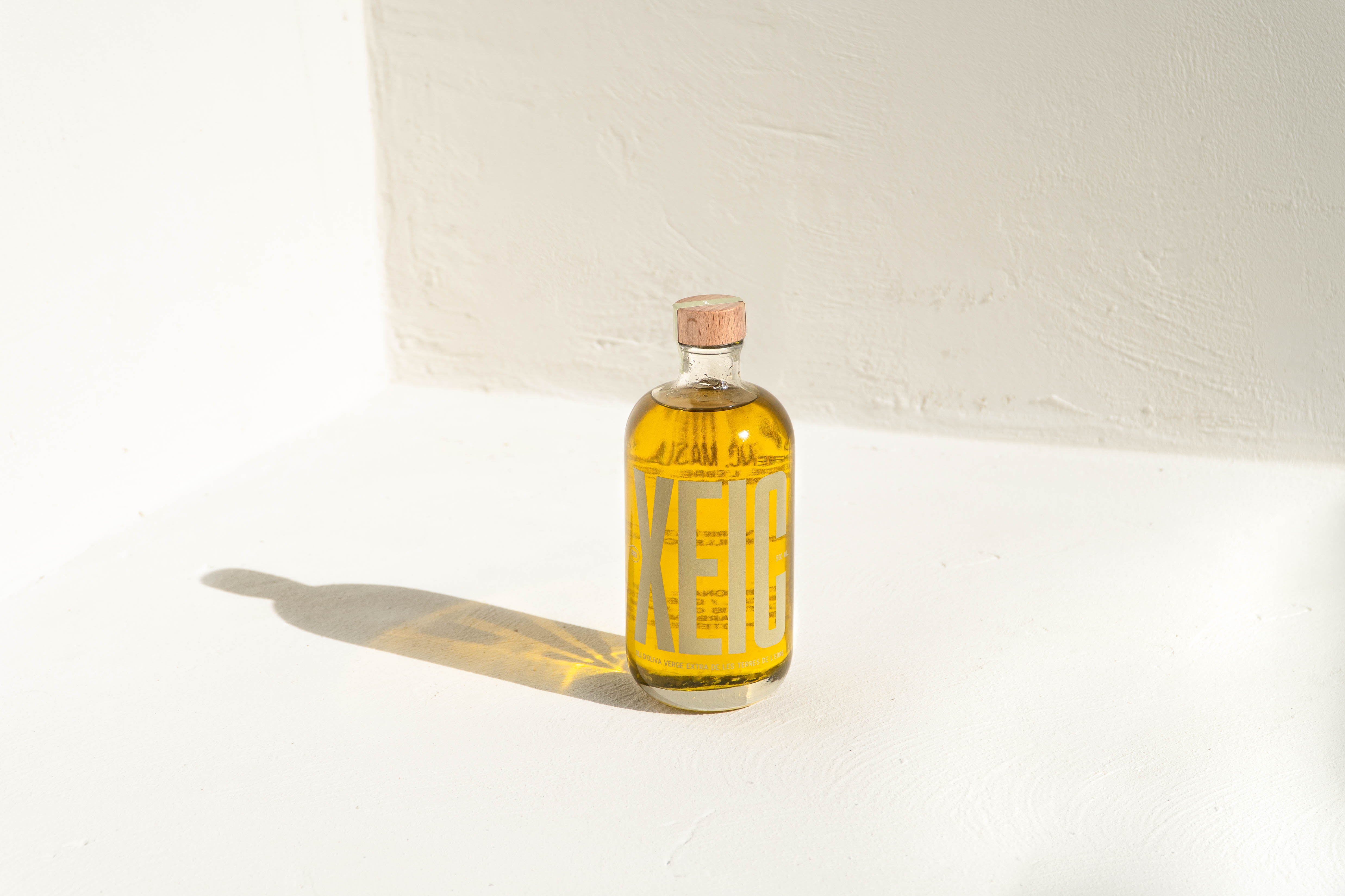
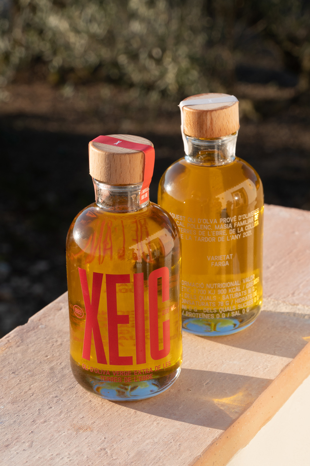
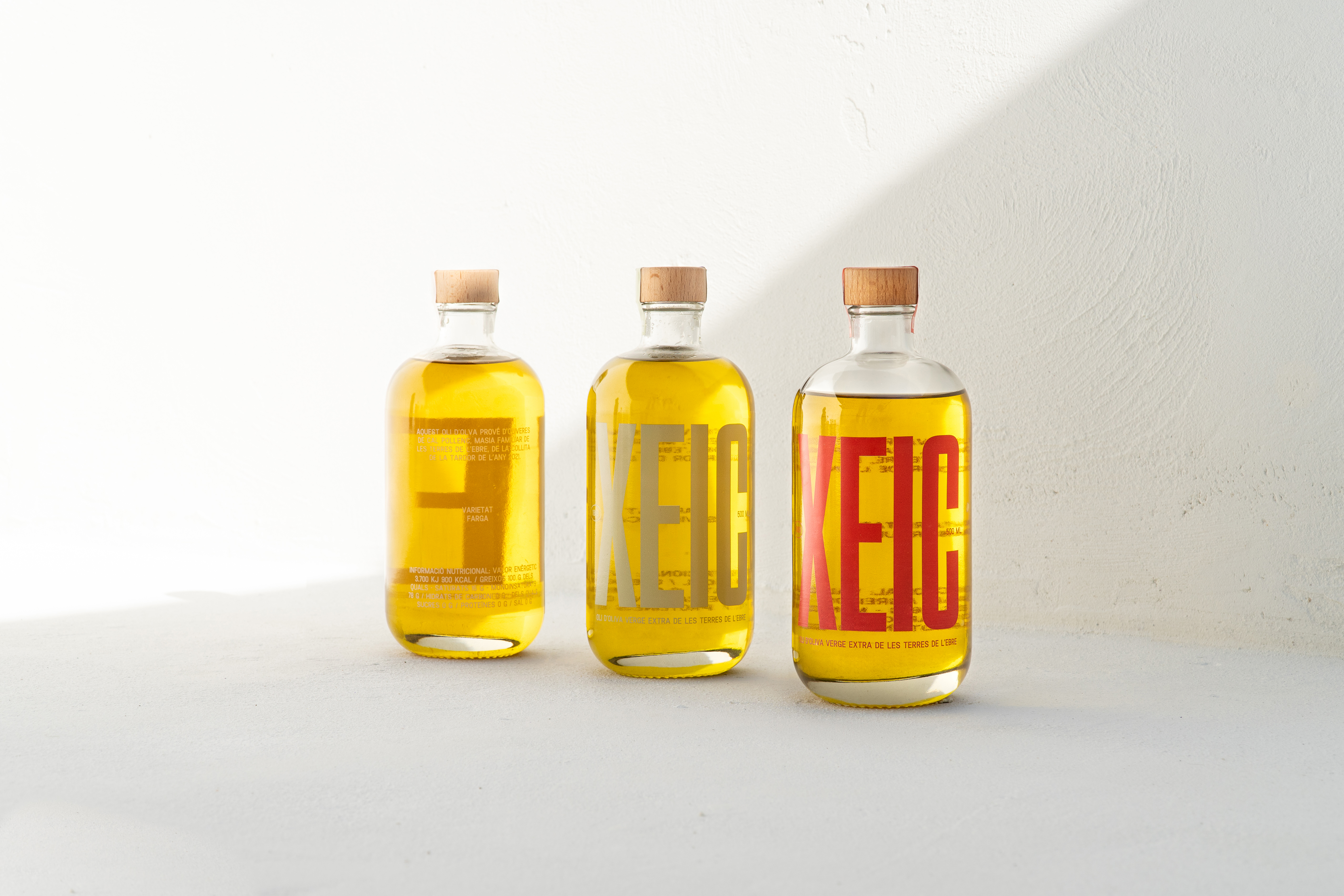
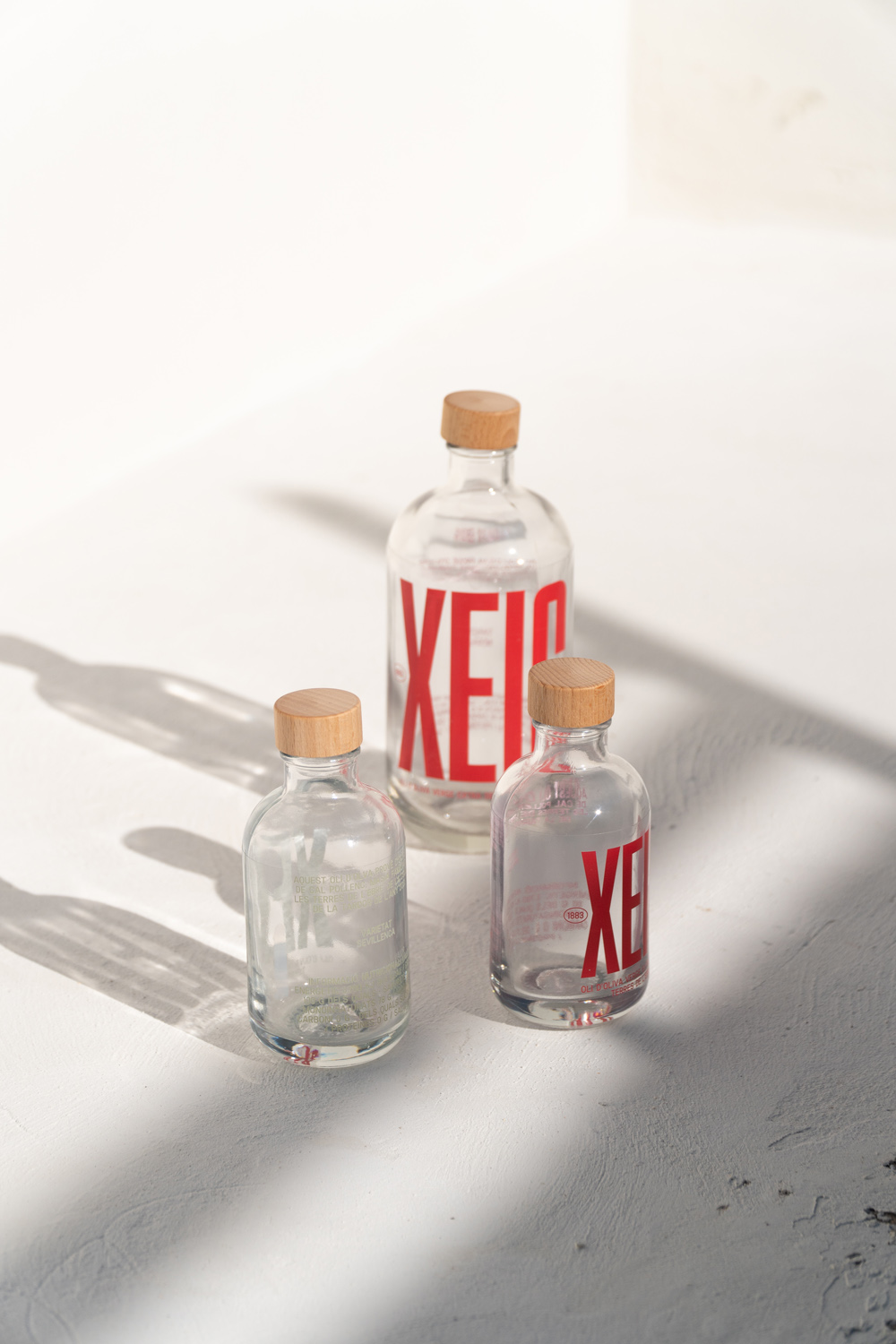
Packaging
L’ampolla 2021
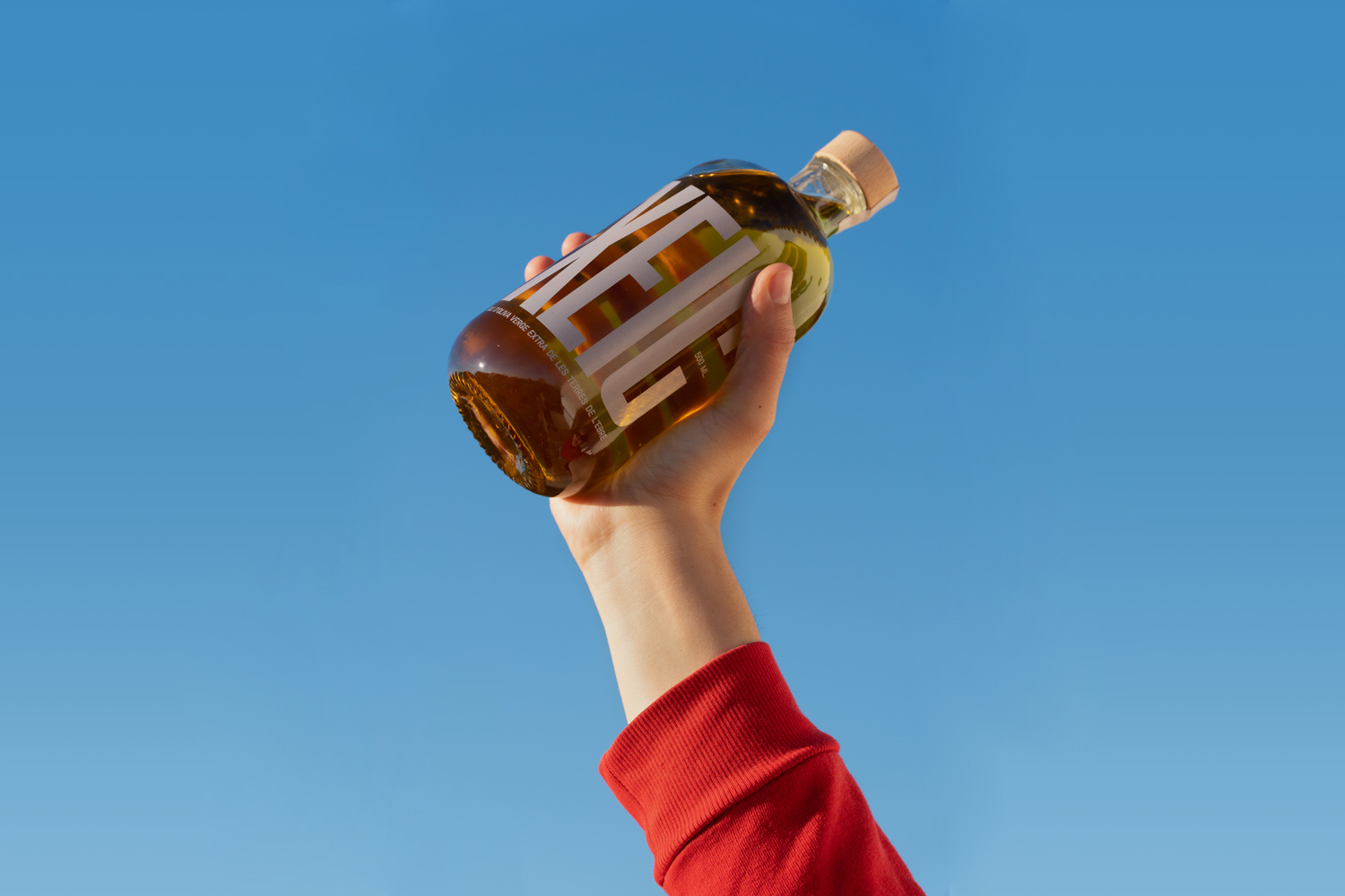
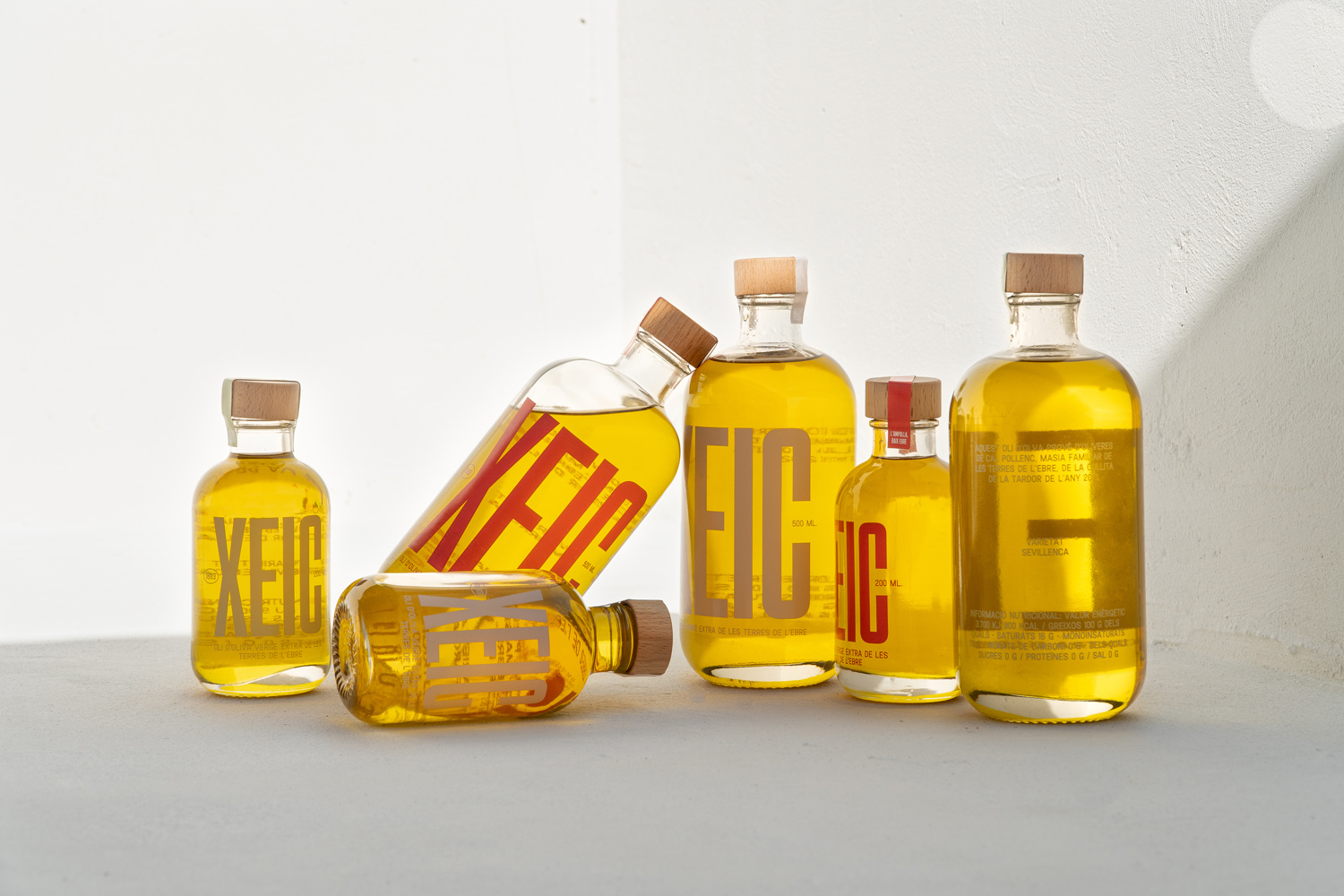
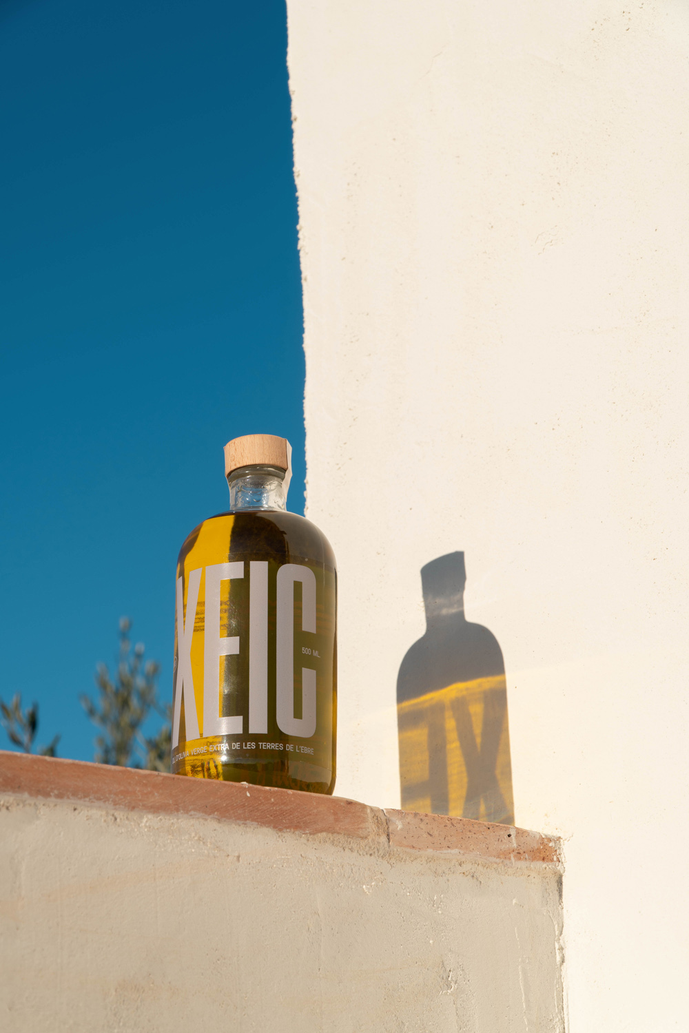
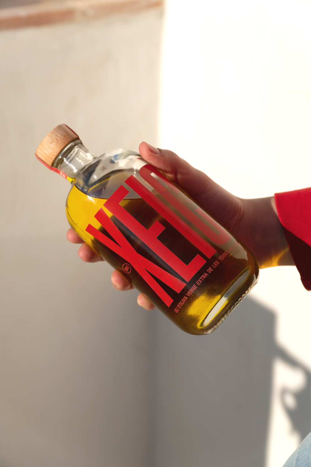
Xeic
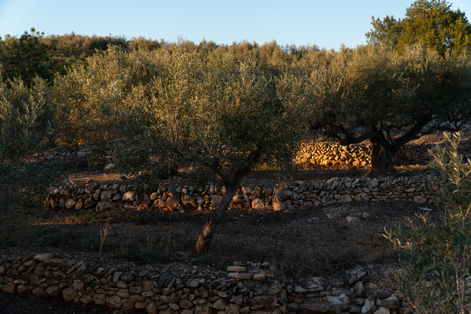
Xeic is an extra virgin olive oil from the south of Catalonia, les Terres de l'Ebre.
It is also a greeting or a call of attention to someone, only used in this unique and exceptional area.